The New Year 2017 has marked the start of many things new for the Tara Chand Group. The company has once again challenged itself to venture into new avenues while maintaining its persistent attitude to change the status quo. The company’s endeavors range from taking over the Vishakhapatnam Steel Plant Stockyards at Vishakhapatnam to acquiring an 800MT capacity crane to becoming the first-ever agency to be listed in RINL’s all India SAP system for providing cut & bend services to becoming the buyer of choice for a lot of 21 cranes of Zoomlion Crane company. The company has also successfully completed three splendid years with Reliance Industries Ltd at the Jamnagar Refinery. True to its core tradition of action with a new thought, the company has once again become the first in its industry to introduce attachments to Hydra Cranes, which make the cranes more efficient and safe for material handling activities. Even more exciting is the introduction of the first-of-its-kind Gantry Cranes for material handling, which is a first for all VSP Stockyards across India.
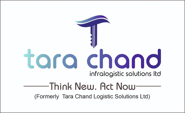
The company is steadily and rapidly moving towards progressive growth and the need is felt to take forward the legacy in a fresh avatar. With this in mind, we have created and adopted a new logo that represents the identity of the company. The logo displays the sheer passion of the company to provide a wide range of solutions while always putting new thoughts into action.
This write-up herein details the concept behind the new logo with a break-up of all components that make up the logo.
‘T’ Logo
The T logo has two components i.e. the multi-color wave and the T itself.
The wave in its various shades of the color ‘blue’ symbolizes dogged persistence. Waves are known to weaken/crack the toughest of rocks with their persistent lashing against them. This reflects the company’s core value of persistent efforts to bring about change even in the face of tough resistance. The range of blue from the lightest to the darkest in the wave represents the repetitive cycle of a wave from its formation to its climax and then re-formation. This symbolizes continuity in the company’s thought process towards innovation and also attests to the company’s resolve to take forward whatever it starts despite the hurdles it faces in its path
The T logo is represented as a modern key that symbolizes the essence of our company’s existence, which is to always provide solutions to our clients while also seeking solutions to our internal challenges and issues. The bold color of the T indicates the zeal with which the company always takes on challenges with solutions that demand bold decisions.
‘tara chand’ logo
The main element of the entire logo composition is the company name, Tara Chand written as tara chand. The two most important aspects of the ‘tara chand’ logo are explained below
The name has been written in lower case. This is to indicate humility in all our actions and words. The company has grown leaps and bounds from a small set-up in Jalandhar, Punjab and it takes pride in the successful journey achieved so far. The uppercase Roman style letters and font from the earlier logo have made way for the lower case and new font to present a modern outlook that appeals to the older generation and more importantly, to the millennial population of today. It is widely understood that the millennial population is tasked with shaping the future of India and our company is confident of playing an important role in doing so.
The second important aspect of the ‘tara chand’ logo is the color blue. The color blue is universally understood and accepted as a representation of ‘honesty, trust, and dependability, which in essence define the promise of the company to its own team, customers, and stakeholders. The blue color spectrum signifies our flexibility and openness to multiple solutions for any challenge that the company faces. The range of colors also identifies with our diversified business verticals. In addition, the blue color range of light to dark represents the starting point and the ending point of a process/action/solution, which reflects the company’s commitment to closing the loop of the related process/action/solution.
“Think New. Act Now”
The slogan is a self-speaking message that the company thrives on a new thought, which is aptly supported by swift action. New thought implies fresh ways of looking at old operational processes within the company and outside, novel ideas for solutions to challenges, creativity in the tools, tackles, and technology used for the execution of the company’s strategy, and innovative methods to retain old customers and acquire new ones. Act Now is an urge to all family members of the company to put thought into action. It can also be interpreted as acting now to start thinking fresh for those who are still stuck in the old ways and thoughts. For our customers, the idea of the new slogan is to perceive us as a company that believes in fresh thinking and is committed to rapidly putting its new ideas into action. ‘Think New. Act Now’ embodies the ‘tara chand’ way of bringing change to the status quo, regardless of the geographical location or the industry of engagement.
The Management
Tara Chand Infralogistics Solutions Limited
16.02.2017

